Visual Design for Social Media: Basic Tips & Tricks
Over the past few years, I’ve seen more and more design requests for social media assets. Now that it’s pretty clear how visual posts result in greater engagement, brands are working hard to make posts creative, eye-catching, and image-based. That’s great! But sometimes it seems like no visuals at all would be better than the ugly visual noise I occasionally come across in my feeds. While you may not always have access to perfect custom photography or an in-house designer, there area few easy ways to make sure your social media visuals are attracting readers to click through, and even better—to share.
Fewer words, please
Readers are scrolling through their feeds so fast, you cannot afford to include lengthy titles and descriptions within the image itself. Save that info for the post copy and ultimate information page, blog post, etc. to which you’re hoping to drive readers. A nice image or graphic (or even a simple brightly colored background) should catch the reader’s eye and complement what little bit of copy is essential for the graphic.

Canva.com is a great resource to DIY design social media assets.

Xenium
Typography matters
About those precious few words you plan to incorporate: don’t detract from them with poor or inconsistent font choices. I actually prefer to try to keep the fonts within brand guidelines, with an exception here and there. Maybe an inspirational quote looks great in that trendy new brush font…but if readers see it in your brand font, you immediately create an association, connecting those inspiring words to the ideals your brand stands for. Maybe your brand font has been around for awhile and it’s not your favorite…consider including it on all company-related posts, and then maybe have fun with an alternate accent font on more casual or specific campaign-related posts. (But try not to go hog-wild on the font experimentation–it’s confusing and dilutes your brand. And this is coming from a fontaholic!)

Nike
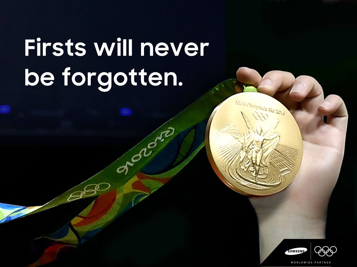
Samsung
Quality photography
Sure, there are times when amateur, candid photography works for a given message. But users are seeing a lot of that from their friends; a high-quality, professional image is going to stand out in their feed. There are a number of paid stock photo sites, eg., Istockphoto.com or Shutterstock.com which can be pricey but worth the investment. Free sites like Pixabay.com or Unsplash.com include a number of images that are free for personal AND commercial use. Whichever way you go, try to make sure your imagery maintains a similar style and tone: if images include filters or effects, keep them consistent; determine if you want to keep images more abstract or literal and stick to your rule; if text is included, ensure the treatment and placement follows a similar convention each time.

image from Pixabay.com

image from Unsplash.com
Colors catch the eye
It seems obvious, but brands sometimes shy away from embracing bold color, when it’s often the most surefire way to catch a reader’s eye. When a user is scrolling through endless photography, the sudden and surprising flood of bright color with just a tiny bit of text can really grab attention. If you have a solid brand color palette, you can alternate which of those colors you use, or maybe connect different colors to different post types, to create a kind of social media sub-branding system.
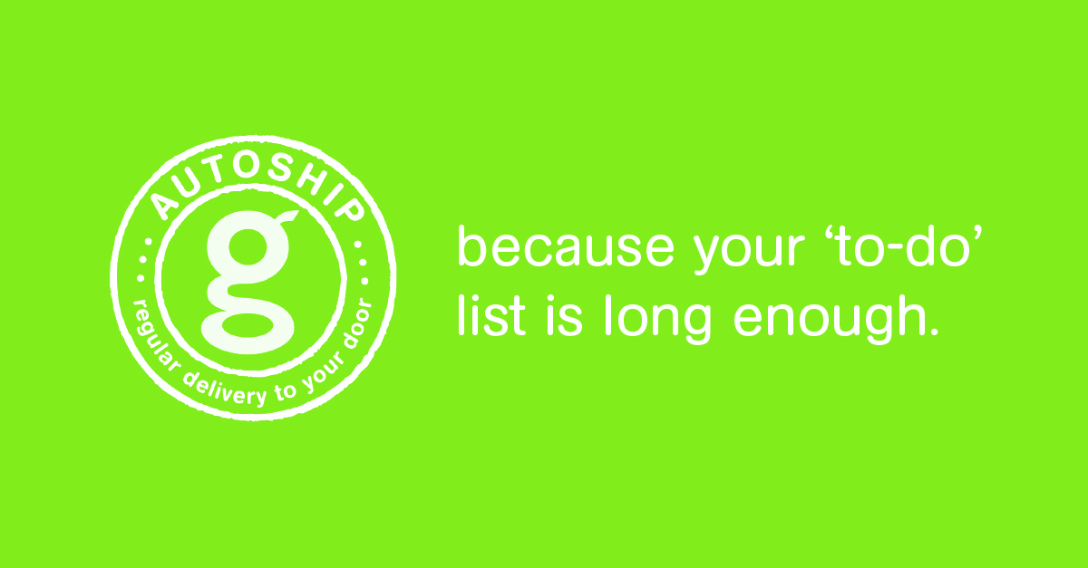
gDiapers
Canva.com
Plan ahead
When in doubt, putting together a social media plan with a corresponding library of images helps to ensure you’ll be presenting a cohesive, seamless brand experience on social media, and reducing your stress when it comes time to post. There is always a certain amount of spontaneity associated with social media, which is part of what makes it so fun and interesting, but you can still have great control over appearances with the right amount of foresight and planning. Let us know if you’d like our help!