Video Backgrounds in Web Design
Not everyone is doing it…yet. But video backgrounds in web design can be incredibly impactful and compelling in drawing the visitor into a brand. Longtime concerns over load times and usability are on the decline as web technologies improve every day, opening up new possibilities to creating an immersive brand experience online. Here are a few cool examples:
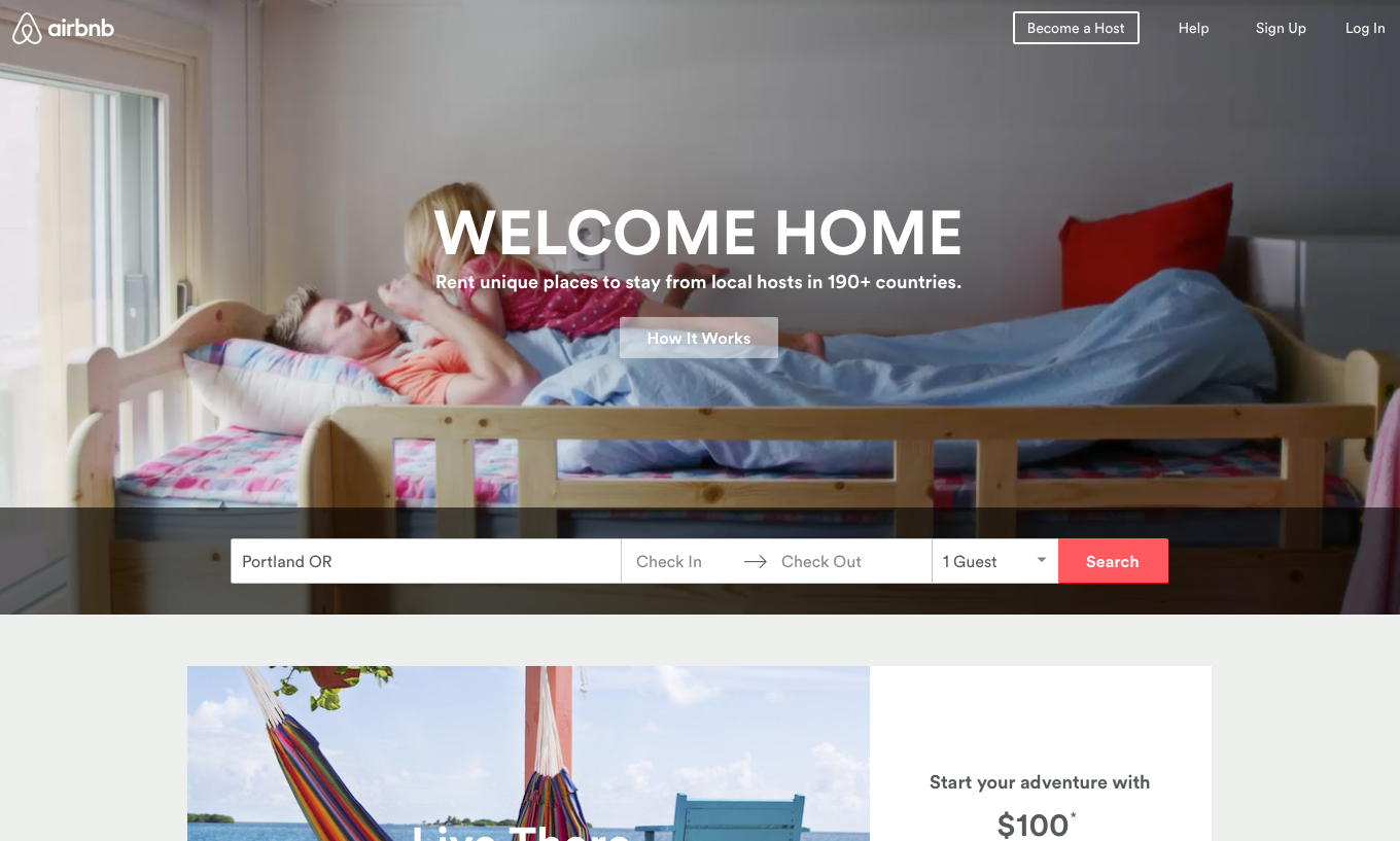
airbnb
We see guests waking up in their borrowed living spaces, exploring their environments, playing, having fun. The videos immediately communicate that the airbnb experience is an easy, safe, inviting home away from home for any kind of traveler.
Gravitate
Local marketing agency Gravitate (Vancouver, WA) gives a little tour of its offices, a “day in the life of” kind of video. If I’m trying to decide between agencies, I already feel like I’ve had a tour of their office—it’s a very friendly invitation to call and set up a face-to-face.
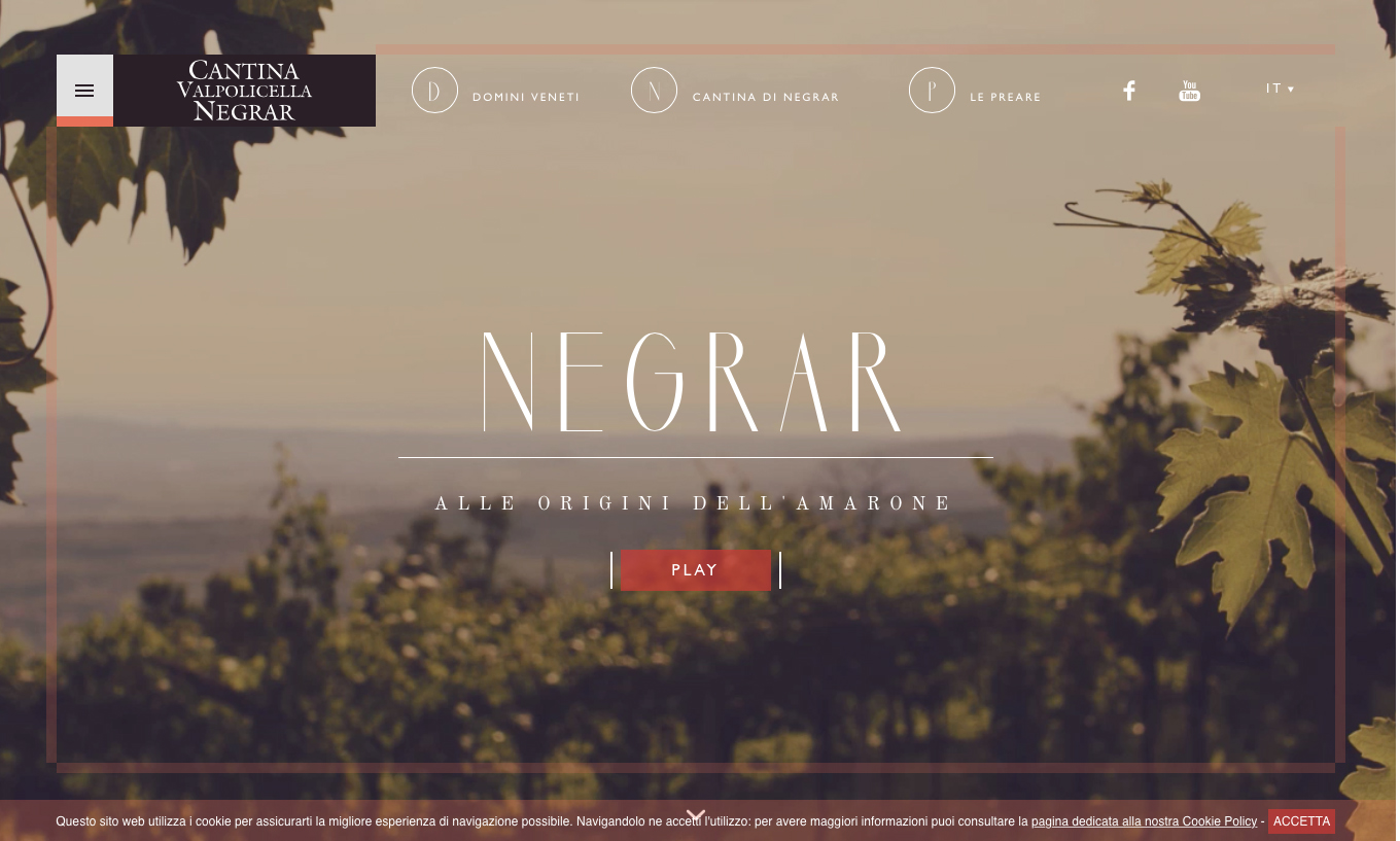
Cantina Valpolicella Negrar
This wine producer’s website will transport you—the grape leaves gently blow in the breeze on a sunny Italian hillside, providing perfect inspiration to learn more about the wine they produce (as if anyone really needs convincing when it comes to fine Italian wine…but I digress).
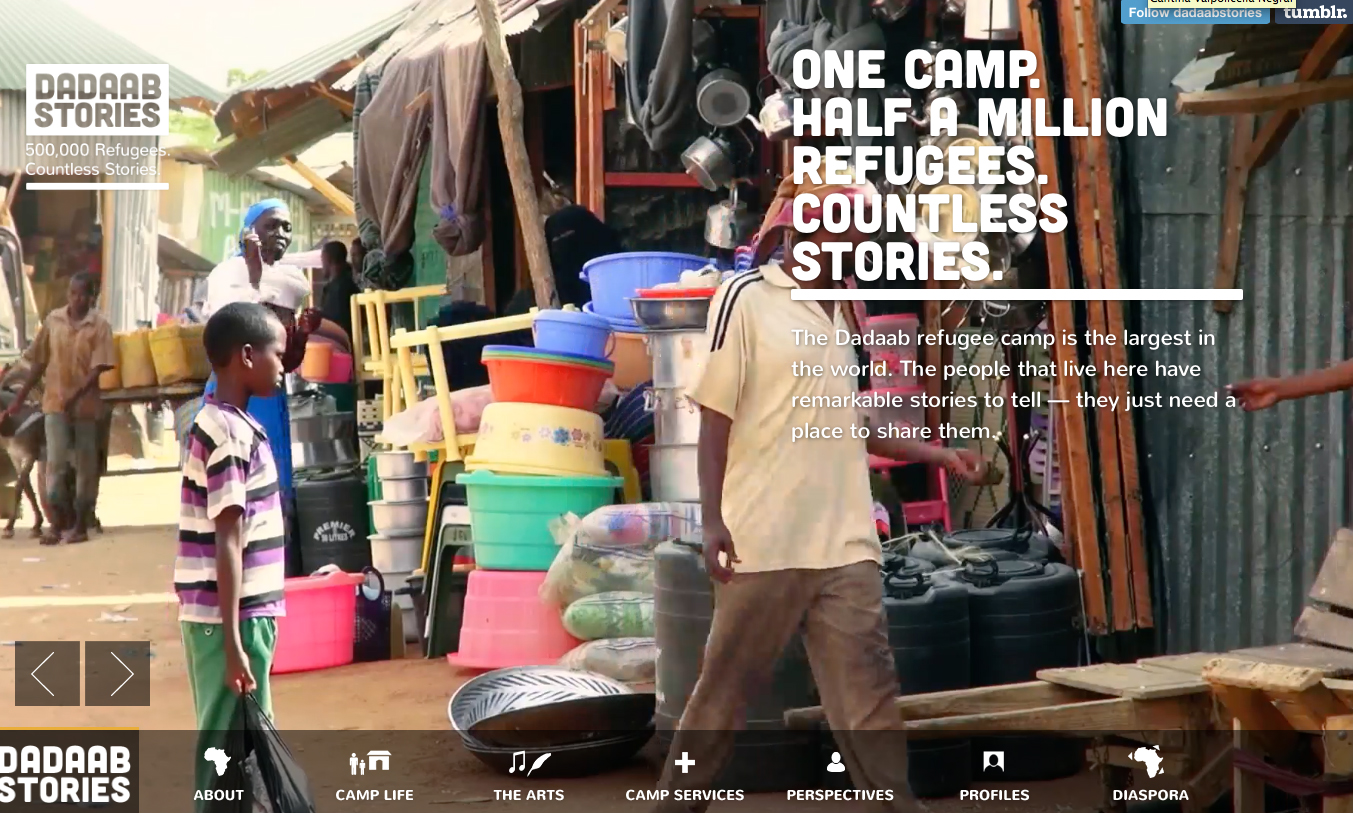
Dadaab Stories
Storytelling is where video enhancement shines, so what better place than on a site devoted to the telling of refugee stories. The background video puts the visitor right there in the refugee camp, immediately conveying that these are real people with meaningful stories to tell—stick around to explore, listen, learn.
What do you think? Do video backgrounds add to the brand experience, or risk detracting from it? Would you consider using video more as part of your brand in the future? It’s fun to imagine the possibilities.


