Selling it with serifs
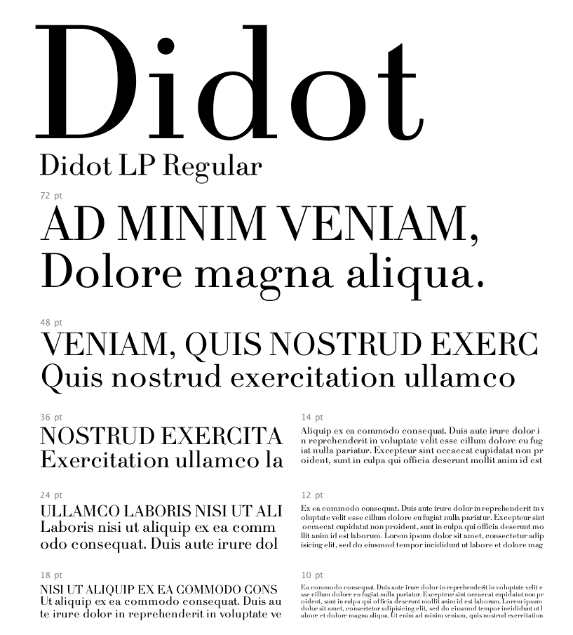
I’ll say it over and over: font choice is so important. It impacts our feelings about a brand both consciously and unconsciously. So is there an essential font to use if you’re trying to make something come across as expensive or luxury? Apparently so. According to Sarah Hyndman, who recently studied the relationship between font choice and perceived value, there are typefaces that convey greater value, and others that look, well–cheap. And the ultimate “expensive” font is: Didot.
Swanky Serifs
As Madeleine Morley summarizes in AIGA’s Eye On Design “After surveying over 368 people, the results suggest that bold typefaces with rounder terminals appear cheaper, whereas lighter weights, serifs, and contrasts are rated appear more expensive, with the modern Didot selected as the diamond of all fonts.”
So what about all the sans serif fonts we’re seeing used in high-end brand systems? Roanne Adams of RoAndCo believes digital culture may play into it: “Considering the digital space, the thin serif characteristics were hard to translate on screen, which has called for stronger, more usable and clear typography.”
A little of each
If you’re unsure of which to use, combinations can work beautifully. This handy tool from Hoefler & Co. can help you figure out perfect pairings, through examples that express “wit,” “energy,” “poise,” and “dignity.”
And now we know: when in doubt, go with Didot.