"Boring" Brands find Big Success through Smart Design
Branding a product or service that’s less-than-sexy has its challenges. This great article in FastCo Design highlights some key ways a number of “boring” brands have hit it out of the park with their digital communications. Brand and web design play key roles in their success. Here are a few of my favorite takeaways, along with the questions the author proposes asking during the design process:
CLEAN & CLUTTER-FREE DESIGN
Of course I love this advice. We’re often trying to cram too much onto the homepage, a page that really should act as an enticing book cover. There’s a fear that the user won’t be interested if they aren’t clear on the whole story right away. But it’s often the opposite—if you can hook a new visitor with just the right tagline or intro, they will explore further. *This does mean that the precious minimal content there has to be carefully crafted, alluring, and spot-on in tone.*
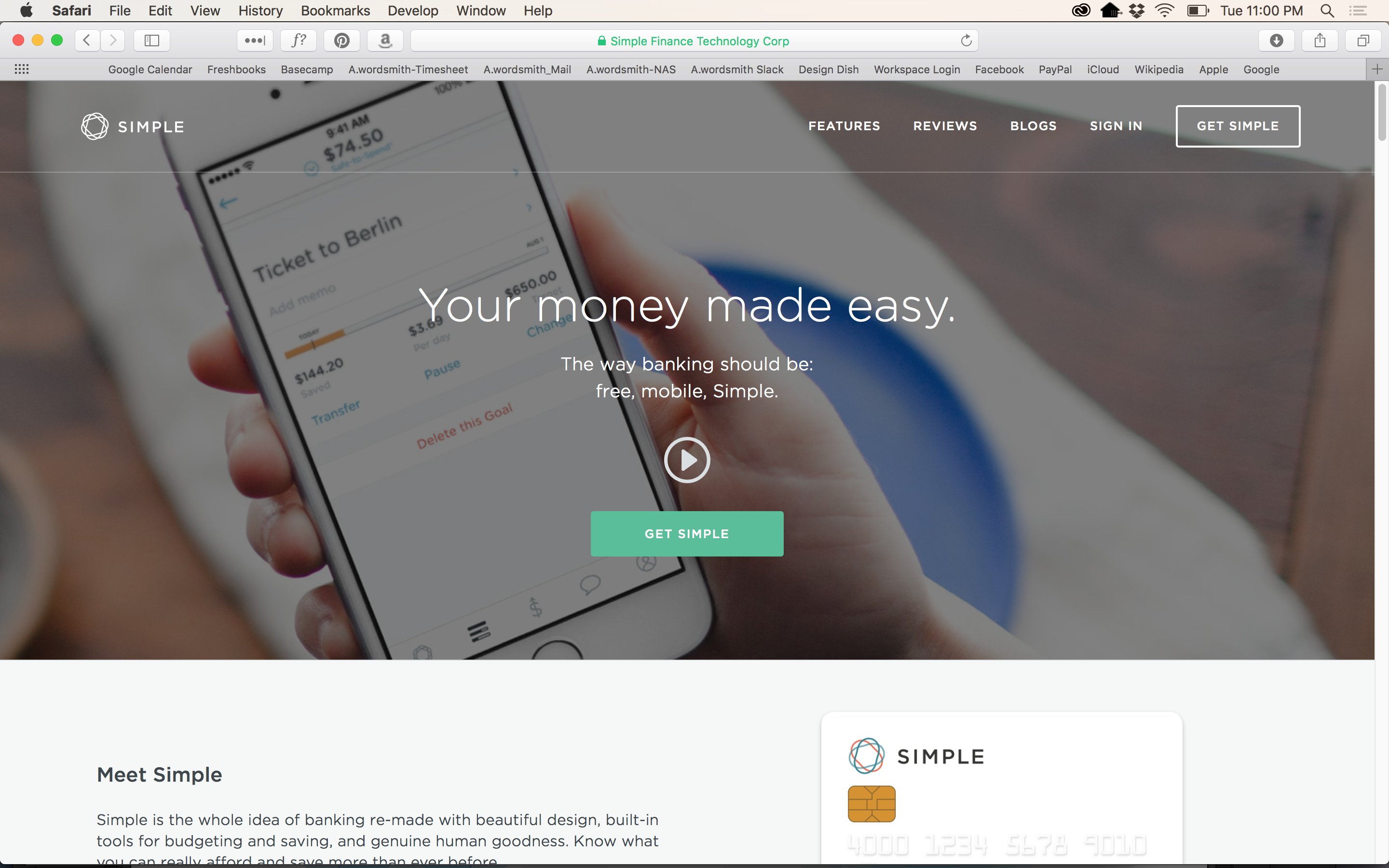
Simple bank’s homepage is just that–simple and to the point.
“Ask yourself: What’s the least amount of information you can give that leaves people wanting to know more?”
FEWER CHOICES
Ever felt like a deer in headlights in the grocery store cereal aisle? Sometimes too much choice is overwhelming, and consequently, detrimental to the user experience. If you have a specific path you want the user to follow, design accordingly. Providing them with too many navigation choices may backfire, and they could leave the site before trying any of them.
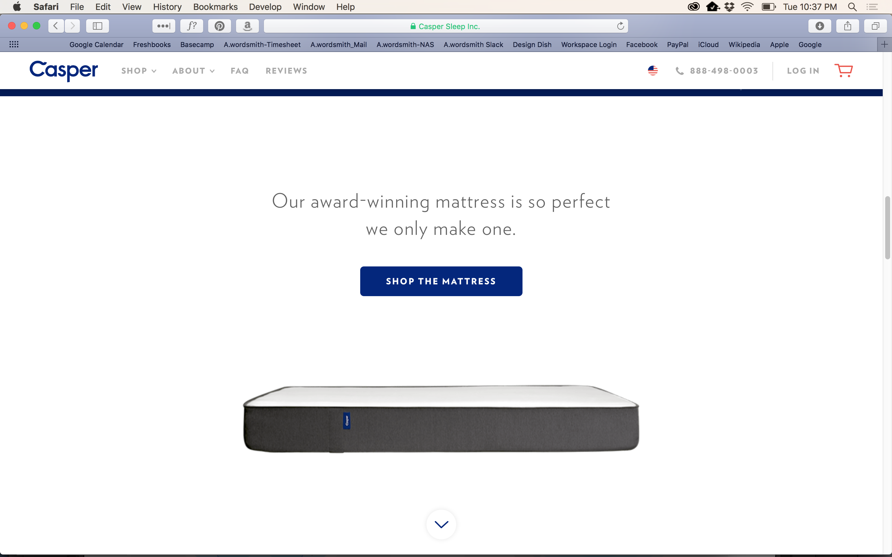
Casper focuses on perfecting one product, and is happy to call that out in their UX.
“Ask yourself: How much choice is just enough?”
DATA-DRIVEN PERSONALIZATION
This is one I’m less involved with from a design perspective, as it’s more data focused, but great to consider as you put your site or app together—let the data you collect from your visitors or participants flow directly back into product design. The FastCo article’s author references bra e-tailer ThirdLove’s successful personalization approach: “For example, ThirdLove’s data set gleaned from their iOS mobile fit app revealed that ‘50% of women sizes A-D fall in between standard cup sizes,’ so they developed an entirely new-to-the-category line of half-sized bras…The ability to wield data in a way that helps your audience suddenly feel a lot less ‘not normal’ is a powerful purchase motivator. ThirdLove’s revolutionary half-size product line is now worn by about 35% of customers, Zak says.”
“Ask yourself: How can aggregated data be used to filter the product selection experience and make it feel more personal and delightful?”
“I FEEL YOU”
Be empathetic. This can be as simple as providing hover tooltips or adding estimated reading time to an article so users can decide whether they have time to click through. How can you make the user’s experience as easy and seamless as possible? Adding special details to ease pain points can go a long way.
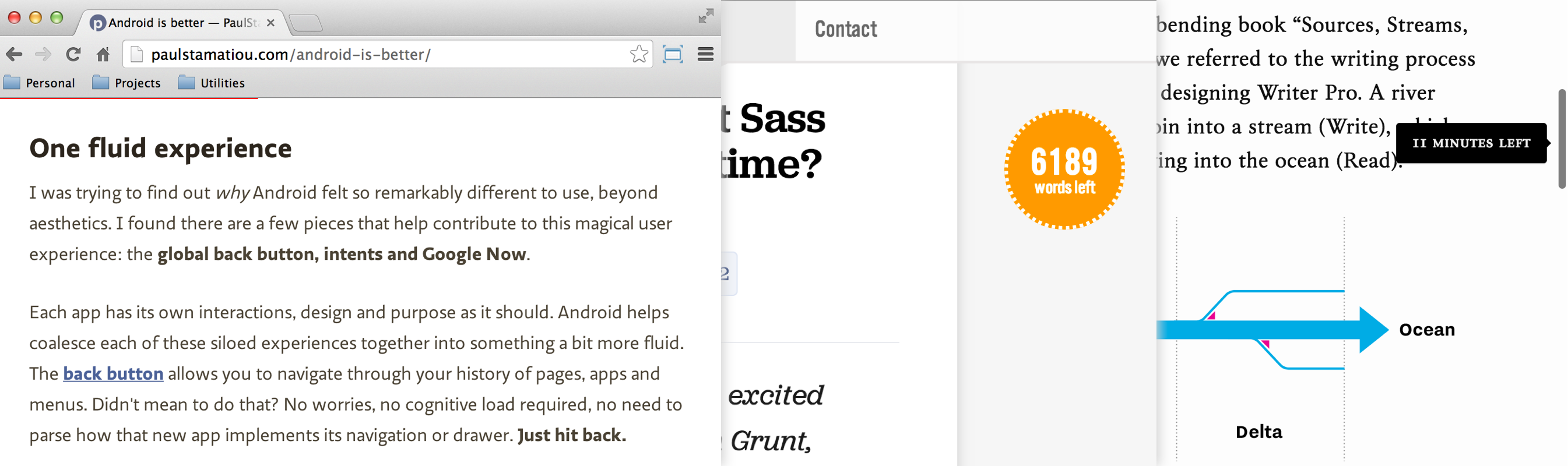
Look over on the far right–see that handy little read-time tip? Delightful.
“Ask yourself: What’s the worst part of a page and how could it become the most delightful?”
AWESOME VIDEO
I posted on video in websites a little while back, and I’ve been watching a lot of new sites embrace quality video in their page designs. It can tell the brand story in such an impressive way, and establishes mood immediately.
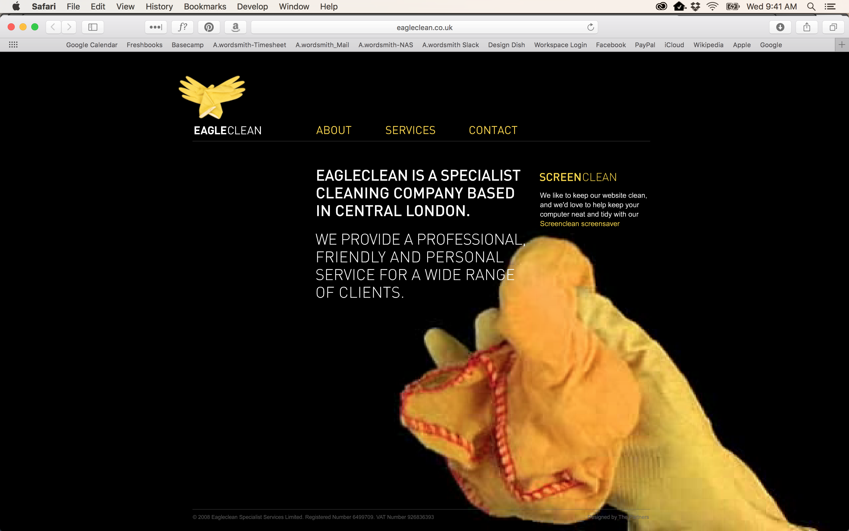
Boring ol’ cleaning services made interesting through clever use of video.
“Ask yourself: Are there easy, evergreen stories about the brand, product, or process that can be told in a compelling way?”
Respect.
When all is said and done, successful design is driven by a respect for your audience, and a thoughtful understanding of how to make their lives easier. Reflect how you value your audience throughout your communications, and they will in turn value your brand. Read more of Fast Co Design’s ideas on how to make a boring brand a surprising success.