Beyond the piechart: Infographics’ rising popularity
They’re everywhere lately: infographics. There are beautiful examples, and there are terrible examples. But I must say, I love a good infographic. As a designer with a passion for reading and learning, these graphics are the perfect blend of content and design, hard facts and artful interpretation. And when done well, these graphics become a handy marketing tool—one that is both educational and engaging.
We are bombarded with information every day; we are increasingly forced to digest and act on information FAST in order to keep up with the speed at which technologies are changing how we do business. Grabbing attention, then inspiring content-sharing is a must when it comes to modern marketing. A compelling infographic is highly shareable, and it also creates a virtual “keepsake” for a brand (don’t get me wrong–a branded pen is great, but a cool, inspiring graphic/message that I can print out and keep on my desk creates for me a stronger emotional tie with a given brand.) Infographics allow a business the opportunity to tell a story or share its mission, in a concise and visually attractive format.
A good infographic will present complex information clearly, allowing the reader to quickly review and digest the material. That’s where so many poorly executed examples fall flat; they’re too complex, difficult to follow, muddied by ugly typography or colors, or they fail to stay focused on the core message. But a good infographic can make even the most mundane or silly topic eye-catching, and before you know it, you’ve learned all there is to know about a winning rock-paper-scissors strategy:
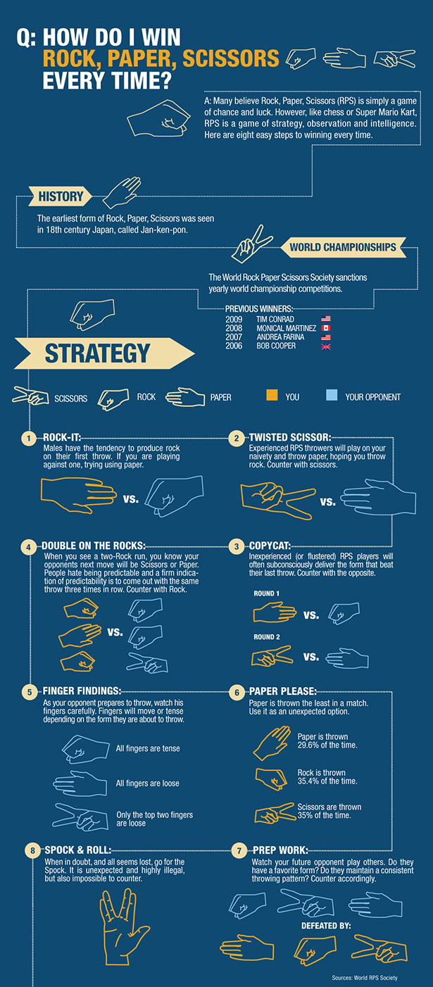
How to win at Rock-Paper-Scissors, according to cha cha.com
Sure, it’s non-essential information. And I don’t know where they got their data. But it’s something that will likely be shared on social media, because it’s a quick, fun read about a game we’ve ALL played. And as you can see, the graphic elements can be super simple—line art and some well-balanced typography could be all you need.
So many people are visual learners. You may get true readers to download a whitepaper, but you will catch a broader swath of viewers with visuals. Visual aids have been a key element of sales pitches throughout history. Did you know that Florence Nightingale leveraged infographics to help make her case to Queen Victoria, to improve hospital conditions during the Crimean War?
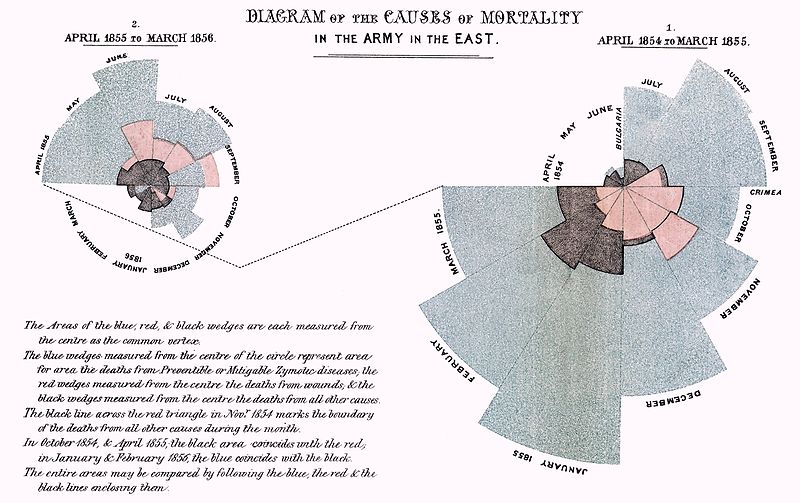
Making her case. Florence Nightingale used infographics, too.
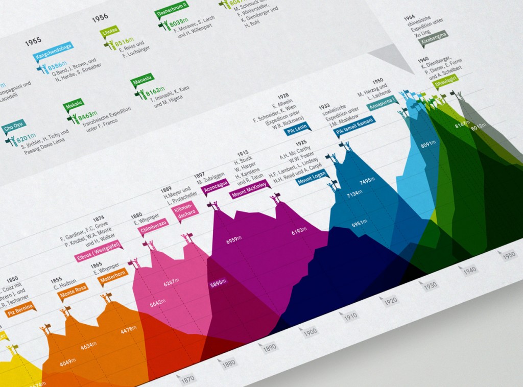
These graphics can be incredibly elegant and detailed, even poster-worthy:
National Geographic has long been a master at infographics.
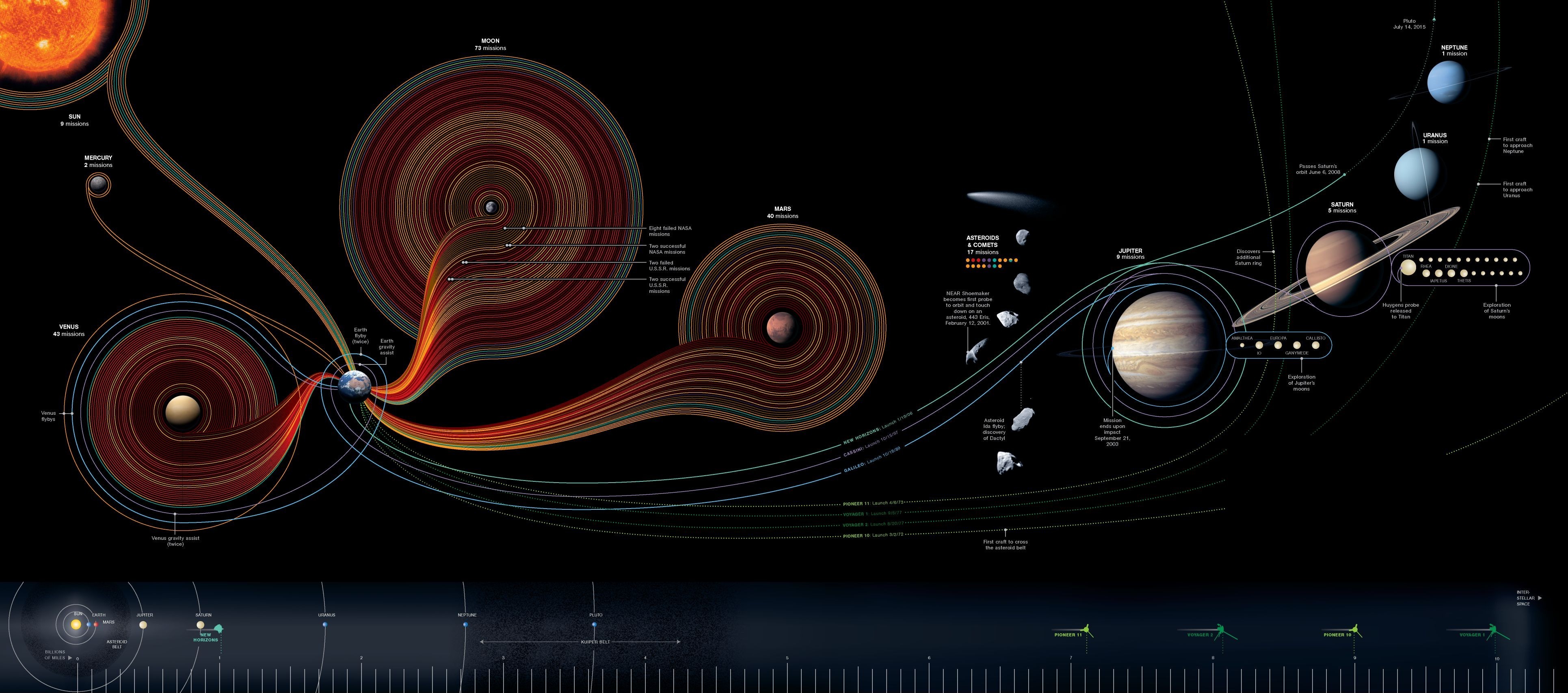
They can be ridiculously technical, and impossibly dense (I think it looks cool, but is it useful? Maybe after a long study…so I would argue it’s not the most effective):
There’s a lot going on here. Technical elements look great, but this graphic requires time to dissect.
They can incorporate crazy amounts of color:
use COLOR!
Or they can fully embrace the style of the artist creating them, like this beautiful hand-drawn example from chalk artist Olivia King:
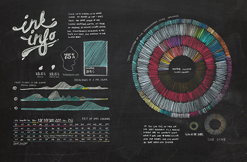
A graphic all about inks…drawn in chalk.
Now, let’s be clear: well-done infographics are not fast or cheap to create, and should be handled by a professional. A designer will create a layout that allows the content to flow correctly, and one which incorporates graphic elements that support and highlight key content pieces, as well as eye-catching typography and a color palette that leverages existing brand rules, all while pushing artistic limits where appropriate. (Please, no clip art or poorly kerned type!) But such a piece could be considered a branded investment; it will be shared, printed, referenced, and potentially utilized as a visual aid during presentations and sales pitches.
I love maps, and maybe that’s another reason infographics appeal to me. They provide a little “You are here” for the reader beginning to navigate their way through all the information you have to share. Where will they go next? You can guide potential customers straight to the [hopefully not so hidden] treasure that is your business.
(I know, I just wrote a bunch of words about visuals. So to get really meta, I’ll sign off with an infographic about infographics…)
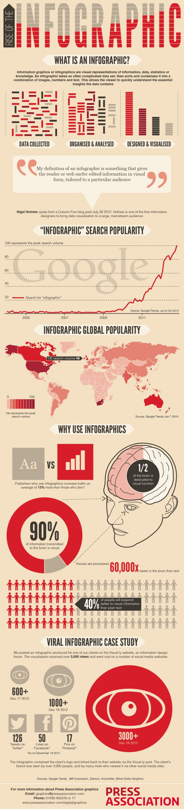
Press Association’s infographic about infographics.