Truth and Fiction in Typography
Designers are always thinking about the best font choice for a given project, and there are a lot of factors that go into that decision. Should the font be serif or san-serif? Modern or traditional? Serious or fun? Wide or narrow? Is legibility important, or can we push it on the style? What age group should this font connect with?
It’s well understood that typography can dramatically impact how a given design is perceived. But can a font choice go so far as to sway us into believing something is true?
Are You an Optimist or a Pessimist?
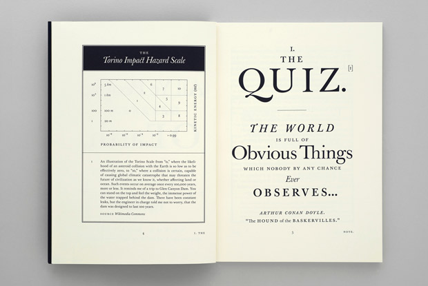
Errol Morris of the NY Times did a sneaky little experiment a few years back where he quizzed readers under the guise of finding out “Are You an Optimist or a Pessimist?” But the real data he was collecting had to do with readers’ responses in relation to the font in which the article’s key points were presented. And his results indicated that Baskerville was the most trusted or believable font of the choices provided (Baskerville, Georgia, Computer Modern, Helvetica, Comic Sans, or Trebuchet). He followed up on the results with a two-part essay in the Times, which has now been published in a 44th edition of the Pentagram Papers, designed by Pentagram’s Michael Bierut and Jessica Svendsen. This is serious business: “The Pentagram Paper is fully illustrated with charts and diagrams supporting Morris’s investigation. Bierut and Svendsen redesigned and expanded the infographics that originally appeared with the essay on the Times website, and also fleshed out Baskerville’s story with historical visuals. All of the typography in the volume, save for the illustrations of the original quiz in different fonts, appears in Baskerville.”

The King’s Speech
Why is Baskerville so believable? Like Bierut says, “In a way, typefaces are the graphic equivalent of the human voice, and each voice has a specific timbre and accent,” he says. “In my mind, Baskerville speaks with a calm, confidence-inspiring English accent, sort of like Colin Firth. No wonder it’s so trustworthy.”
Read an interview with Morris to hear his take on all this. (He now writes all his manuscripts in Baskerville, in case you were wondering.)
I hope I’m not surprising anyone in stating that we all know to avoid Comic Sans by now. I’m also loving the recent resurgence in solid, stately serif fonts on the web…perhaps we’re all seeking a bit more truth amidst the fiction that flourishes online.