6 Design Tips for Better White Papers
In our digital world of social media attention spans and interactive brand experiences, the traditional white paper isn’t necessarily the most exciting way to convey content. But white papers still play an important role in many B2B organizations, as objective and informative pieces to aid sales, act as lead generation tools, and provide a means to position an organization as a thought leader in a given field. How can you ensure people will actually read your white paper? I have a few design pointers to help liven up this traditionally text-heavy document.
Make it read like a story
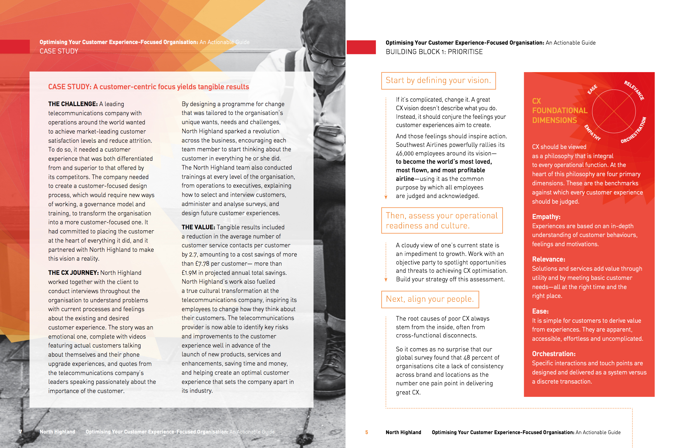
When I’m confronted with a wall of text, the first thing I want to do is break it into digestible chunks. Even if these chunks of content end up being a number of pages, I still find “chapters” easier to process than a run-on document. Breaking the white paper content into sections provides opportunities to insert visual interest elements like photography, graphic title treatments, or clever subtitles. Allowing the reader to take a break and come back later makes for a better, less burdensome reading experience.
Include images
Relevant photography and graphics support the content and provide visual interest. They also allow for visual “rest” as the reader processes technical content. Abstract imagery can highlight larger overall themes, especially if woven in as a series.
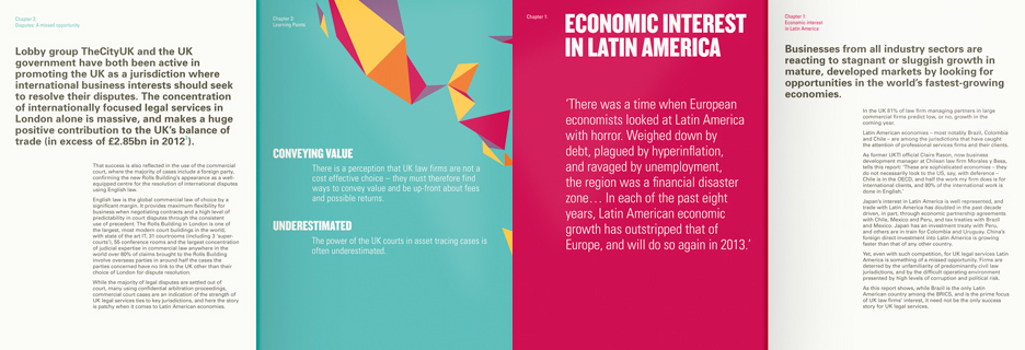
White Paper for North Highland
Use interesting layouts
Full-page columns are uninviting and difficult to read; leveraging multiple columns, ¾ column layouts with sidebars, and ample use of whitespace make for a much more interesting reading experience. Thoughtfully placed callouts and quotes give readers a taste of what’s coming, break up the page, and add a bit of variety in color and typefaces.
White paper example from Ascend Studio
Include infographics
White papers often include lots of facts and figures, and those data points are much more interesting and impactful in graphic form. Charts, tables, and even type-based data callouts help highlight key pieces of data, and add pops of color to otherwise plain pages.
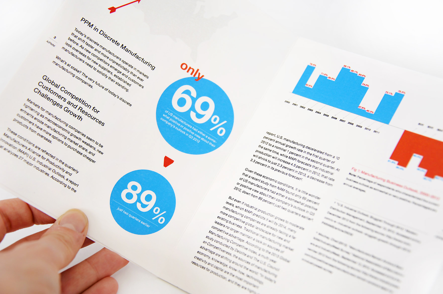
White paper example from Art Version
Embrace white space
Yes, white space will result in increased page count. But I am much more willing to read a longer piece with a comfortable layout than a shorter piece with cramped, tedious blocks of copy.
White Paper for Sparks Grove
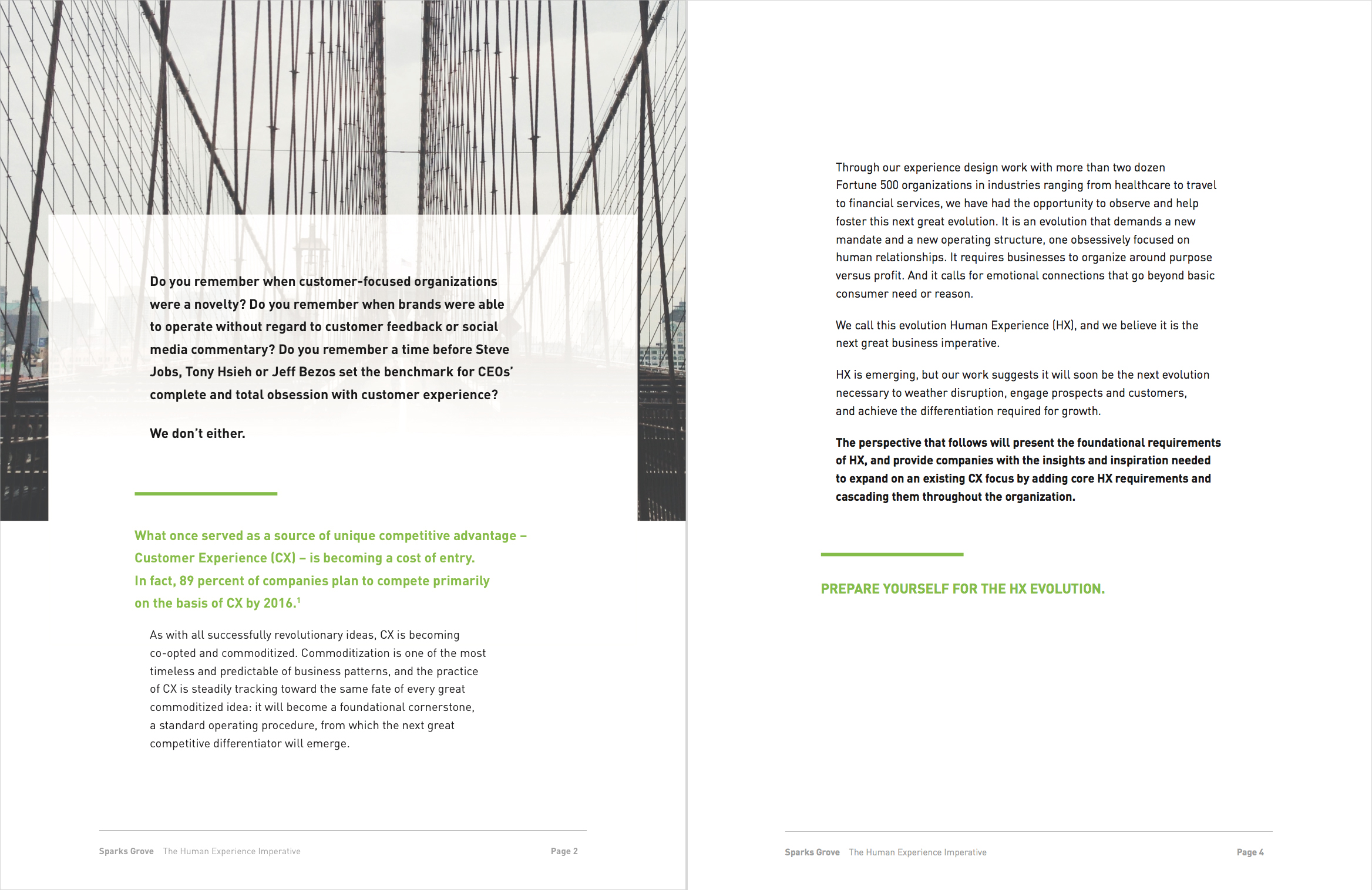
Make it colorful
Embracing whitespace does not mean avoiding color. Thoughtfully placed pops of color help create visual hierarchies, and immediately enhance an otherwise boring page. Some of the most text-heavy pages are immediately improved with just a spot of color or two.
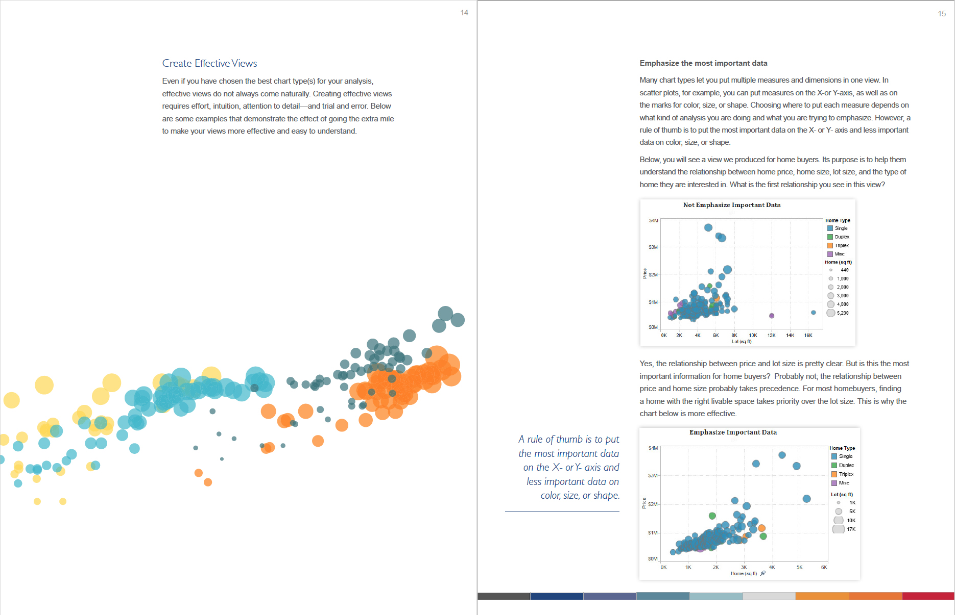
Tableau Visual Analytics White Paper
A beautifully designed whitepaper looks professional, is a pleasure to peruse, and represents the expertise contained within. A positive visual experience helps legitimize the content and create a sense of trustworthiness for the reader. It also makes the piece much more shareable, making for broader exposure to your content and brand.