Measuring Humanity: The Value of Qualitative Data
KPI, ROI, conversion rates, likes, bounces, clicks, followers, page views…the list goes on and on when it comes to the hard data in marketing metrics. As a designer, how something looks and feels has always been most important to me, but I’d be remiss if I didn’t consider whether a design was achieving its marketing goals. Success can be hard to measure when it comes to visual work. Without page views or social media metrics, how do we determine if a design is resonating? Obviously, sales growth is an important measure for brands, but there’s so much messy human nature wrapped up in brand loyalty, too. This is something I think about a lot.
Enter soft data, or the tracking and visualization of qualitative data. This can be about as fuzzy as it sounds, and in my opinion, just as important. It can also be incredibly specific and personal, and can tell stories that hard numbers cannot. It can shed light on consumer behavior, document seemingly insignificant aspects of daily experience, or even paint a poignant picture of despair.
Quality over Quantity
Qualitative data is especially meaningful to me since there are so many aspects of what I do that aren’t immediately measurable in numbers. As Elyse Bogacz, Staff Product Designer at Drift states, “Qualitative data will give you a lot more information than you think if you ask the right questions and are honest with yourself about who your user is. Quantitative data is a luxury, especially for a small business… so when you’re just getting started never underestimate the power of conversations.” Asking clients how they’re feeling or what feedback they’re getting from customers is just as important as counting the click-throughs. Talking about opinions around fonts and colors genuinely gives me insight into a client’s goals for their brand communications. I sometimes in jest refer to the process as “design therapy.” But it’s no joke—it’s necessary to create meaningful work.
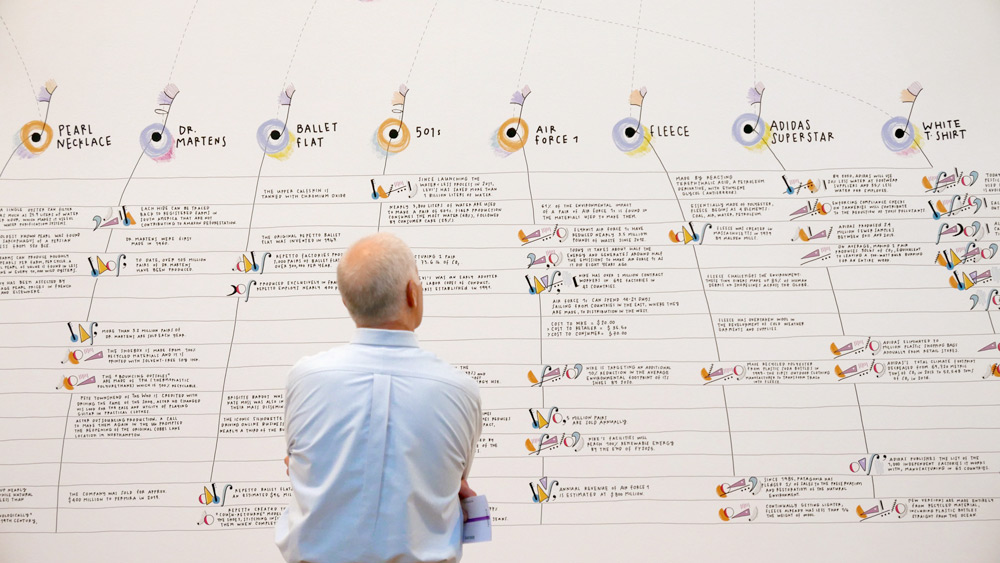
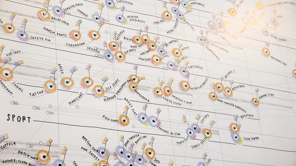
A Fashion Landscape
While practical applications are essential for good business, collecting qualitative data can also be an anthropological pursuit, or even an artistic one. I love this article, Data ITEMS: Exploring the Power and Depth of Soft Data for the Museum of Modern Art, covering the author Giorgia Lupi’s collaboration with MoMA’s teams to create a data-driven art show titled Items: Is Fashion Modern? She refers to this type of documentation and visualization as “…Data Humanism: to make data faithfully representative of our messy and intricate reality and meaningful for our complex nature as human beings, I believe we need to start designing ways to include empathy, imperfection and human qualities in how we collect, process, interpret, and display them.”
The Human Data Behind a Diagnosis
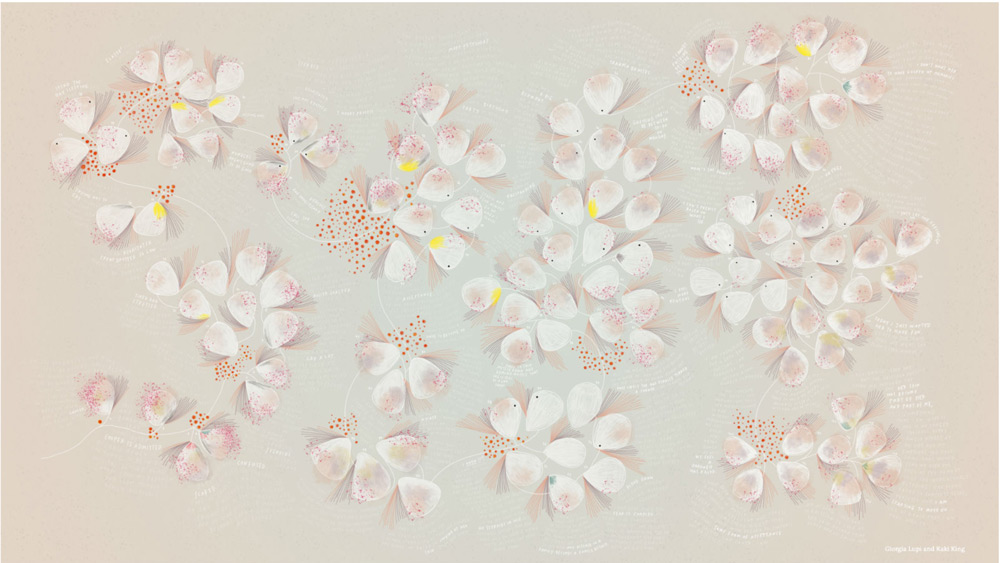
Giorgia Lupi’s data visualizations have also been more personal. As her friend and creative collaborator Kaki King struggled with her eldest child’s mysterious and rare autoimmune illness over many months, they documented the experience. Then they put their own personal data into a multimedia visualization, a beautiful and haunting illness infographic tracking family timelines, symptoms, and feelings.
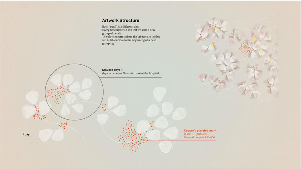
This dataset shares facts and events, but it also captures emotion; it provides a more holistic view of the family’s experience.
A Measure of Meaning
In this particular and extraordinary moment, as we rise to the biggest global challenge of our lifetimes, data is flying at us faster than we can process. We study charts and confirmed case counts, we pore over maps to determine which regions are highest risk. We attempt to wrap our brains around the unbelievable death toll. Perhaps harder to find, there are positive numbers to track in this crisis, too. While we desperately need the hard data right now, as The New York Times list of names illustrated last Sunday, it is the soft data we capture during this international experience that will mean the most over time. I encourage you to document your experience, moments big and small. There will be so many stories to tell.